This post walks through the data and methodology behind our growth and burn multiple benchmarks, summarizing some of the key decisions we made in calculating them and providing some benchmark tables that might be useful for venture-backed software startups. For a more detailed interpretation and “what this means for me”, read this post.
What is “Good” Growth and “Acceptable” Burn?
The performance of any software startup can, at a high level, be characterized by how quickly they’re growing and how much they’re spending. If you’re growing at 300% year-on-year, but burning $20M a year, are you really that much better than a competitor growing at 250% while only burning $10M? Probably not. But what if they’re growing at 200% instead? What if they’re burning $15M instead of $10M? Where do you draw that line?
To try and answer this question, we came up with a tool to quickly plot your growth and burn multiple relative to other startups of a similar size. (Did we mention size can affect the growth vs burn calculus too? We’ll get into that a bit later.) Give it a shot and play around with your own numbers. What does it take for you to move up and to the right?
Growth Benchmarks
The first half of “growth vs burn” is growth, so we’ll start there. Below you can see the benchmark data for Y/Y Forward ARR Growth, calculated from our Scale Studio dataset of several hundred SaaS companies, private and public.

The methodology here is similar to how we calculated our other benchmarks, except we expanded our dataset on the high end to include public SaaS comps, since our early-stage dataset doesn’t contain many $150M+ ARR companies. To account for public companies’ GAAP financials, we estimated ARR as Quarterly GAAP Revenue * 4. While not perfect, taking this approach should give us a good enough estimate of Y/Y growth rates and greatly expands the dataset for growth-stage companies.
Looking at the table above, the obvious but key point is that growth rates are size dependent. A 50% growth rate at $100M ARR is a company that has a real chance for an IPO, while 50% growth at $1M ARR is venture death. Thus, any benchmarking on growth rates is only meaningful if you’re comparing yourselves to other comparably sized companies – which is why data-backed benchmarks are hard to find.
Now on to the second half of “growth vs burn”.
How we measured “Burn”
The simplest burn metric is absolute burn – the dollars spent per year. In some sense, that is the only pure measure. You start with some money, you spend an absolute amount, and you either do or do not have cash left at the end. In a binary world that is all that counts.
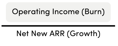
However, if you want to measure how efficiently you’re burning cash, you need to have a measure of the burn relative to results. A simple measure of capital efficiency is the Burn Multiple:

David Sacks coined this term and lays it out extremely well in his Burn Multiple blog post, where he walks through the metric, it’s applicability, and how to use it.
Burn Multiple declines with Company Size
Like growth rate, Burn Multiples are also size-dependent. Early-stage software companies start off inefficiently, which makes sense given a company’s relatively high R&D costs and low ARR as they’re finding product-market fit and beginning to scale their GTM machine. As companies grow and NNARR increases relative to their burn, the Burn Multiple continues to improve – until, eventually, they become profitable, at which point the Burn Multiple becomes less helpful in lieu of other metrics for efficiency (discussed further below). For example, on average companies with $0M – $1M ARR have a Burn Multiple of 3.4, while companies with $25M – $50M ARR have a BM of 1.4. This trend continues as companies grow.

Burn multiple is better (lower) for higher-growth-rate companies of the same size
This was one of the most surprising conclusions we discovered when looking through the data. Anecdotally, we would have initially predicted that high-growth companies would be the most inefficient. It turns out to be almost the exact opposite.
To look at this, we ranked companies within each ARR band by their relative growth performance (throwback to our earlier section on growth). Looking at the table below, higher growth (top decile / quartile) companies have the best (lowest) Burn Multiples within their ARR band. This trend mostly holds across ARR bands.

Instead of high growth coming at the expense of efficiency, what we see is that high-growth startups are, on average, more efficient than companies with slower growth. Only efficient companies can sustainably be high growth.
Even if companies have a relatively high level of absolute burn, BM measures the ratio of burn and growth. High-growth companies have a higher denominator (NNARR) in the BM equation which, it turns out, outweighs the higher absolute burn. For example, a company starting at $5M ARR and adding $10M in NNARR but burning $15M (BM = 1.5) is more efficient than a similar company starting at $5M ARR, adding $5M in NNARR, and burning $10M (BM = 2.0) – even though the high-growth company is burning 1.5x more than the lower-growth company.
Stepping back, the data shows that capital allocators are doing a pretty good job of putting money into companies that have high growth and efficiency (and, conversely, starving low-efficiency companies). Instead of high growth companies being inefficient, capitalism means that only efficient companies can be high growth. However, we have anecdotally seen an increased willingness to fund higher burn multiple companies in the pursuit of higher growth over the last few years.
In conclusion…
The numbers and tables above might seem like a lot, and it’s easy to get lost in the noise without answering “what does this mean for me?” This is where the 2×2 tool we mentioned at the beginning comes in. By combining the growth and burn multiple benchmarks, we’ve made it simple to quickly visualize a two-year trajectory of your growth and burn multiple performance relative to similarly-sized companies. As Rory mentioned, looking at just growth or burn in isolation isn’t very helpful. Hopefully our tool can help you think through if, and how much, to cut the burn without overly impacting growth.
If you have any questions or comments on the material above (or the supporting details below), please reach out to me at edi@scalevp.com
Technical details
Double-checking our growth calculations
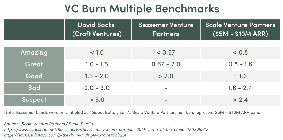
To double-check our data and growth calculations, we compared our benchmarks to those of a couple other VCs (seen below). Looking at the table, our data ties roughly to works other investors have published.

Additionally, when looking at the top decile across ARR bands in our Y/Y Forward ARR Growth table from earlier, you can see the classic “T2D3” trajectory starting in the $1M – $2.5M ARR band – but it should also be clear that this only applies to the highest growth companies out there and isn’t achievable for everyone.
Double-checking our Burn Multiple calculations
Like we did with our growth benchmarks, we also wanted to cross-check our BM numbers to what other VCs have published over the years. David Sacks wrote one of the earliest posts on the Burn Multiple we’re using now, and Bessemer had an earlier version of an “Efficiency Score” that is essentially the reciprocal of the Burn Multiple (NNARR / Burn).

Although we all use different scales (Amazing – Suspect, Good/Better/Best, pooled average +/- 50%), it’s reassuring to see that what we’re seeing for good Burn Multiple performance is roughly the same as prior benchmarks.
Cumulative Burn Multiple Sense-Check
Although it varies by size, across our all the data in our dataset the average BM is about 1.6x (higher for early-stage and lower for late-stage companies). In other words, the typical SaaS startup burns $1.60 for every $1 in net new ARR in its lifecycle from seed to IPO. As (another) sanity check, SaaS companies going public have typically raised ~$300M and have ~$200M in ARR which would result in a burn multiple of 1.5 – very close to 1.6 and supporting our approach.
Operating Income vs Absolute Cash Burn
As you may have noticed, in the Burn Multiple formula we use above, we’ve substituted Operating Income for Net Burn. In our data, we find that OpInc is reported more accurately and consistently than cash burn – and OpInc is usually within 10% of reported cash burn numbers anyways. So, for the sake of simplicity and comparability across companies, we’ve stuck to GAAP OpInc for our Burn Multiple calculations.
BM by Quartiles
Above we split up BM by companies’ growth quartile within each ARR band (“top-quartile growth companies with $2.5M – $5M in ARR typically have BM of ~1.8”). Another view is to just look at the quartiles of BM across bands, without filtering by growth performance.
This view shows the ranges for each absolute BM quartile within each ARR band. One thing to note is that, for readability, we trimmed companies with BMs below 0 (i.e., cashflow breakeven) to 0 and companies with BMs greater than 10 down to 10. So, when you see BMs of 0 in the table, think “profitable” and when a BM is >10, think “very inefficient”.

We find this table less helpful than the growth-filtered view above, as it potentially looks at high-growth and low-growth companies together. What is reassuring to us, seeing this quartile view, is to see that the median BM within each ARR band is very close to the pooled average for each band, which is what we are using for our 2×2 quadrants.
Why did we use pooled average?
One other note about our Burn Multiple calculations at the band level. For the full-band numbers we chose to use the pooled average, rather than the mathematical average or median of individual company BMs. We found that by using the pooled average (summing up all the individual company OpIncs then dividing by the summed NNARRs) we were able to smooth out the impact of edge cases, specifically companies that were slightly cashflow positive or had a decrease in NNARR (as seen in the 0’s and 10’s above).
Additionally, because of the variance in BM across growth percentiles (as we saw in the main section), and to more easily compare companies of the same size regardless of growth performance, we ended up using the pooled average BM for each ARR band in our high-level benchmarking and the 2×2 tool.
BM correlation with other efficiency metrics
As we’ve discussed in previous blog posts, there are other efficiency metrics to keep an eye on as a SaaS company, such as Sales Efficiency and Magic Number. These are correlated with Burn Multiple (e.g., high Sales Efficiency = low Burn Multiple) because, at scale, distribution economics drive overall software economics.
Growth, BM, and Valuations
We began by saying all conversations are about how much to grow, how much to spend, and what is the result worth. These growth and Burn Multiple posts have all been about the first two questions, but we haven’t yet touched on “what is the result worth”. We plan to circle back and talk about how to think about valuation in a later post. Spoiler alert, the Rule of 40 is not the answer.